Primary
Blazing Boost means more gaming, less grinding, with expert boosters and mentors. Download official logos and follow the colour, typography and usage guidelines. If something isn’t covered, ask before publishing.
Three colourways, one logo. Full colour is the default and lives on Midnight or darker. White goes on brand colours, photography and busy art. Black is for light backgrounds, print and single-colour jobs. Each colourway ships as portrait, landscape and the flame mark on its own. Dark shows the versions made for dark surfaces; Light shows the black set.


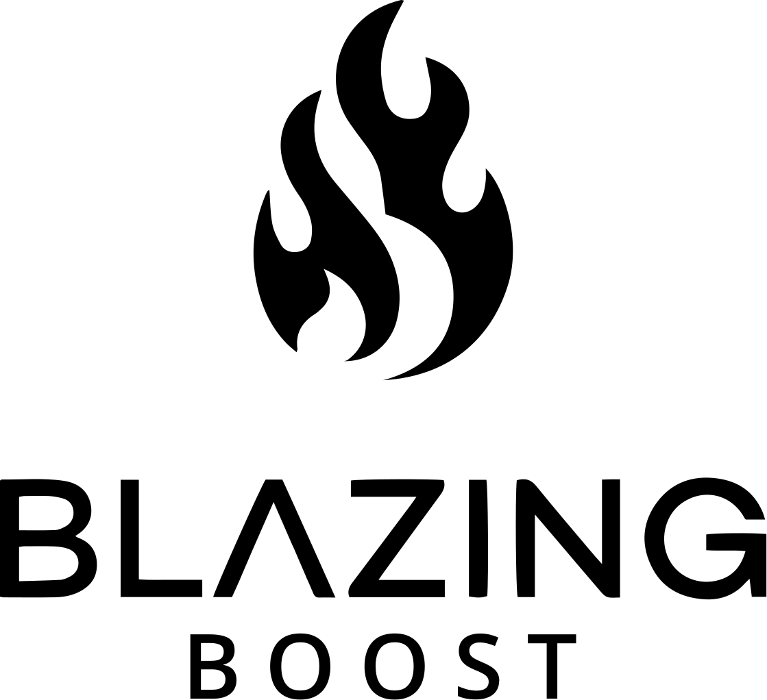

Use the master asset at full colour on dark and leave it alone. The flame is the most recognisable part of the brand. If a placement cannot hold the full-colour lockup cleanly, change the placement, not the logo.
Default on Midnight or darker: website, email, social and adverts.
All white, flame included, for brand colours, gradients and key art.
One colour on light surfaces: print, documents, embroidery, engraving.
X = cap height of BLAZING
Give the logo room to breathe. The clear space is X, the cap height of BLAZING, measured from the outer edges of the flame and wordmark on all four sides. Nothing enters this zone: no text, artwork, UI or other logos. The same rule applies to the landscape lockup and the mark.
Portrait lockup no smaller than 120 px tall (25 mm in print). Landscape lockup no smaller than 160 px wide (30 mm). Below that the tracked BOOST line stops reading cleanly, so drop to the flame mark, which holds down to 24 px (6 mm). Measure digital sizes at 1× on a 1080-wide canvas. When in doubt, go bigger.
In text the name is two words with capital B’s: Blazing Boost. It becomes one word only in the domain and handles, blazingboost.com. The wordmark is a logo lockup, not a spelling. Never Blazingboost, BLAZING BOOST in running copy, or Blazing Boosts.
Never recolour, outline, rebuild or decorate the flame, and never mix a coloured flame with a mono wordmark. A mono logo is all white or all black, flame included. Only the three colourways above exist; if it is not in the master file, it is wrong.
Blazing Boost lives on Midnight. Brand Blue and Indigo carry the energy in gradients, CTAs and the flame, while Lavender and White do the reading. Backgrounds are always Midnight or darker, never white. Tokens are from the Blazing Boost Design System primitive ramps (p-color/*). Click a swatch to copy its hex.
Accents sit on Midnight, never as backgrounds, and never more than two accents in one composition. Supporting text is Lavender, Neutral/11 and Neutral/10; headlines are White.
Alpha tokens layer the brand colours over Midnight for glows, hover and pressed states, dividers and glass panels. Each chip shows the token over Midnight on the left and over Deep Indigo on the right. Apply the token, never an eyeballed opacity.
The four 12-step primitive ramps behind the tokens: 01 is darkest, 12 is lightest. Click a step to copy it.
Every Blazing Boost gradient makes the same journey the flame makes in the logo: Indigo into Brand Blue. Four gradients cover almost every use. Use them as supplied: never invent new stops, never add a third colour, never run a brand gradient through text and never stack one on another.
#512CD5 → #4C65F9 · left → rightTwo families do supporting work in adverts. Text gradients lift a headline off the art and are for headlines and support lines only, never body copy. Seasonal accents belong to a campaign and retire with it. Click any to copy the CSS.
Text gradients
Seasonal accents, campaign only
Every advert closes with the Trustpilot micro bar, so its colours sit alongside ours. These are Trustpilot’s own brand colours: use the official assets as supplied and never recolour, redraw or restyle the stars or the mark.
Two typefaces, two jobs. Blender Pro is the heading face: every headline, title, eyebrow, caps label and big number, always uppercase, tracked at +3%. Roboto is for supporting text only: paragraphs, captions, buttons and labels, always sentence case. Roboto is never set in uppercase and never used as a heading.
Sizes are in px at 1×; line height is a percentage of the size unless stated; tracking is a percentage of the font size. Every Heading, Eyebrow and Caps style is Blender Pro, always uppercase, +3% (eyebrows +23%). Body and Label styles are Roboto, sentence case.
The headline voice: always uppercase, tracked at +3% of the font size. Eyebrows go wide at +23%. Blender is never set in sentence or title case.
Blender for the headline, Roboto for the line under it. Headlines are seen; paragraphs are read.
How Blazing Boost shows up in paid media and social. Every advert follows the same stack whatever the size: message left inside the safe zone, artwork right and allowed to bleed, one idea, one offer, one call to action.
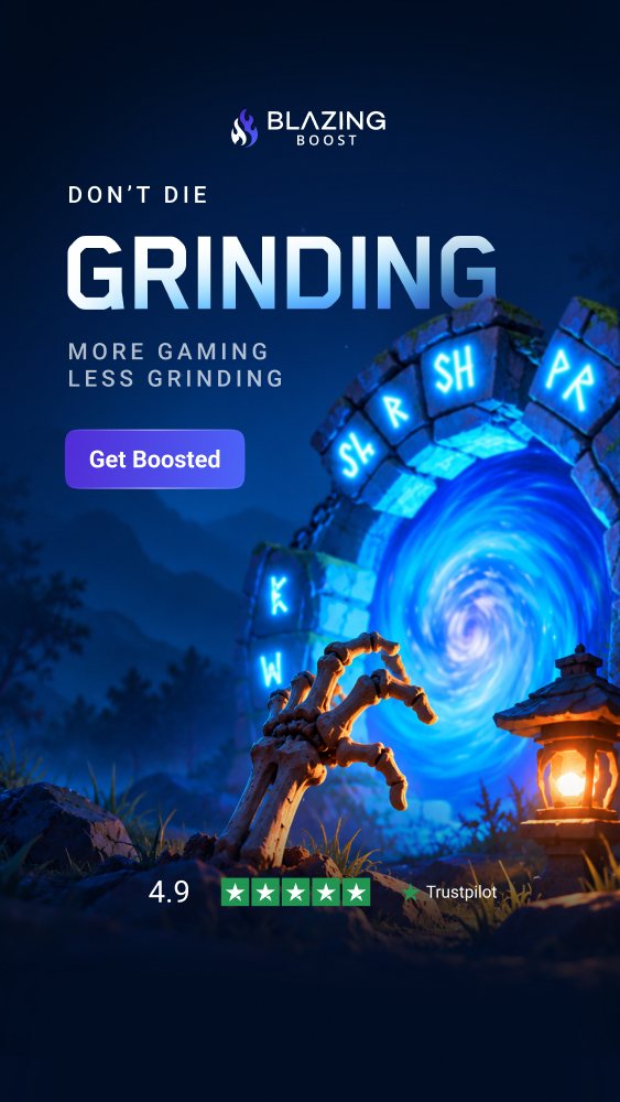
This is the 1080×1920 Stories master. The 300×600 display master uses the same order with 88 px clear zones instead of the Stories safe zone. Built from the landscape lockup, the CTA component, the Trustpilot micro bar and the Stories safe-zone overlay.
 1
2
3
4
5
6
The landscape lockup opens every story: centred, 190 px from the top, safely under the profile row. Full colour on dark, never recoloured, outlined or rebuilt.
Kicker in Blender Pro Medium (Eyebrow style), uppercase, +23% tracking. Headline in Blender Pro Bold, uppercase, +3%, the largest element in the ad. One idea, two lines at most.
One line of proof under the headline in Blender Pro Medium caps: an outcome or a number, never a slogan.
One verb-first label in Roboto Medium, sentence case, on the Indigo → Brand Blue gradient. 16 px radius at 300×600, 47 px at 1080. One CTA per advert.
One piece of key art, right-weighted, breaking out of the frame. It may tuck behind the headline but never cover it, the CTA or the trust bar. Keep the top and bottom thirds calm so type sits on quiet areas.
Every ad closes with the Trustpilot micro bar: 4.9 or ‘Excellent’, five stars and the mark in white, centred, just above the 1,248 px line. Official asset only.
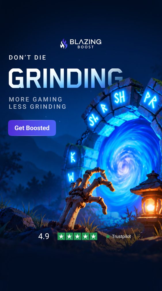
Four 1080×1920 story masters from the current campaign set plus the light Skip the Grind master and a Halloween feed square. The artwork changes, the stack does not.
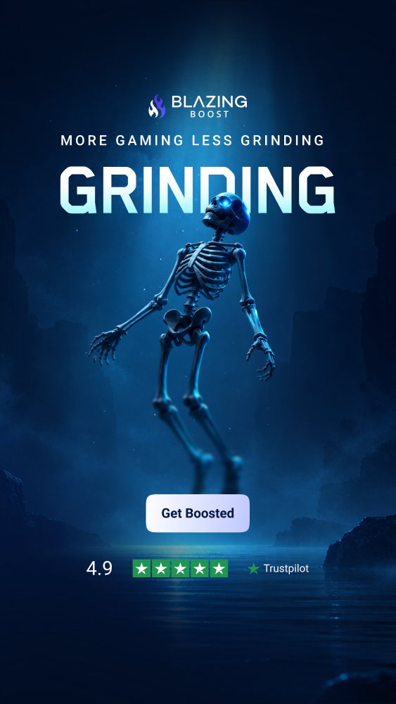
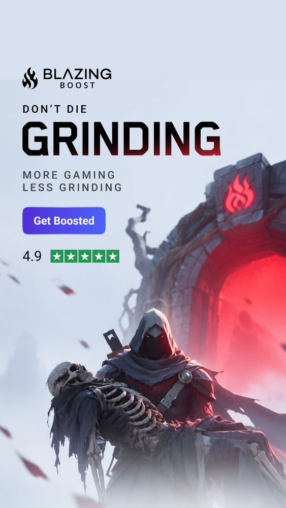
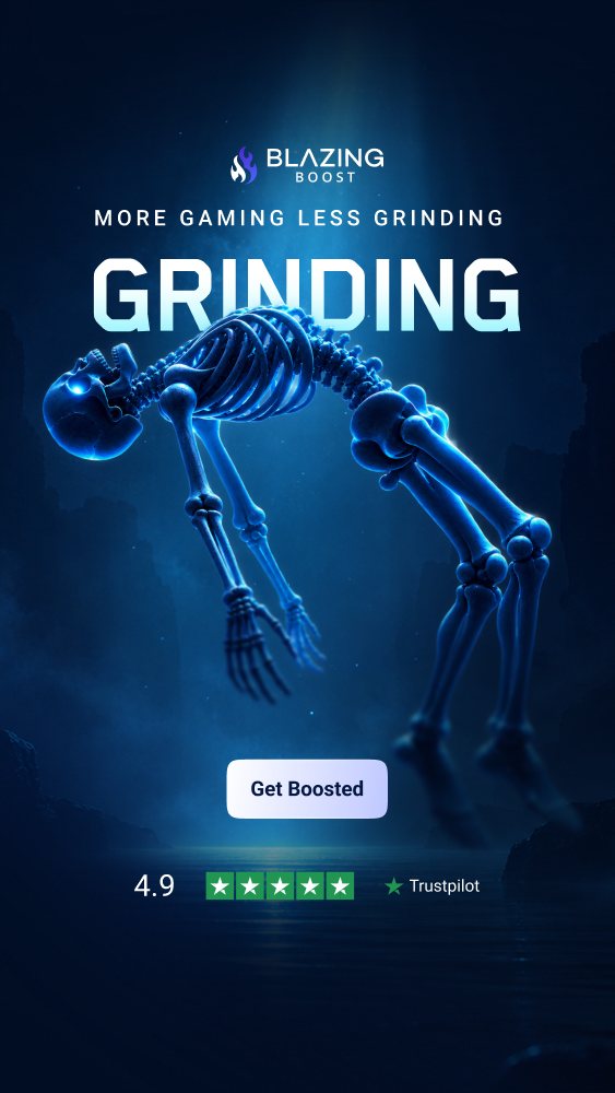
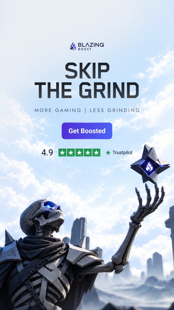

Build on the 300×600 master and export every placement from it. Meta assets export as PNG or JPG at 1×. Google Display and AdRoll assets must be PNG or JPG under 150 KB each, so compress before upload. The core four cover most placements on both platforms; start there.
| Size | Placement | Platform | Notes |
|---|---|---|---|
| 1080×1080 | Feed square | Meta | PNG or JPG at 1× |
| 1080×1350 | Feed portrait | Meta | PNG or JPG at 1× |
| 1080×1920 | Stories and Reels | Meta | Keep the message inside the safe zone |
| 300×250Core | Medium rectangle | Google Display, AdRoll | Under 150 KB |
| 728×90CoreNo logo | Leaderboard | Google Display, AdRoll | Headline, offer and CTA only |
| 300×600Core | Half page, the display master | Google Display, AdRoll | Export every placement from this |
| 320×50CoreNo logo | Mobile banner | Google Display, AdRoll | Headline, offer and CTA only |
| 160×600 | Skyscraper | Google Display, AdRoll | Under 150 KB |
| 970×250 | Billboard | Google Display, AdRoll | Under 150 KB |
| 336×280 | Large rectangle | Google Display | Under 150 KB |
| 320×100No logo | Large mobile banner | Google Display | Headline, offer and CTA only |
| 600×315 | Native landscape | AdRoll | Under 150 KB |
| 600×500 | Native | AdRoll | Under 150 KB |
| 600×600 | Native square | AdRoll | Under 150 KB |
Thin banners run without the logo: there is not the height for it. Headline, offer and CTA only; the brand carries through colour and type. Templates live in Blazing Boost Assets › Assets/Guides.
When a 1080×1920 advert runs on Instagram and Facebook Stories and Reels, the app’s own interface sits on top of it: account name and profile picture, the Sponsored label, navigation, captions, the reply bar and the call-to-action button. Keep text, logos and critical visual hooks out of the danger zones and anchor everything that matters inside the safe zone. Key art may bleed into the danger zones; the message may not.
 Safe zone
250 px · 13%
369 px · 19%
1,248 px · 35%↑
1,580 px · 18%↑
0 to 250 px (13%), up to 369 px (19%). Heavily masked by the account name, profile picture, Sponsored label and app navigation. Keep the logo and headline below 250 px, below 369 px to be safe.
The bottom 340 px (18%), up to 672 px (35%). Covered by the reply bar, captions and the CTA button. Nothing important below 1,248 px. The Trustpilot bar sits just above that line.
65 px (6%) on each side. Ultra-tall screens and dynamic cropping clip the outer left and right margins. Keep important elements inside the centre 88%.
Centre 88% × 250 to 1,248 px. Anchor the logo, headline, offer, CTA and trust bar here and the creative renders cleanly on Stories and Reels at the same time.
Every 1080×1920 template carries a hidden layer “Guide · Stories safe zone (keep hidden)”. Toggle it on to check placement; keep it hidden on export. Before exporting, preview the creative against the Safe Zone guardrail in Meta Ads Manager and check the Meta Business Help Center Safe Zones guide for the latest layout rules.
Every advert ends the same way: one call to action and the Trustpilot micro bar. The CTA is a single verb-first label, three words or fewer, in Roboto Medium sentence case on the Indigo to Brand Blue gradient. The trust bar closes the ad with the 4.9 score or ‘Excellent’, five stars and the Trustpilot mark, centred, 150 px off the bottom edge. Official Trustpilot assets only.
